『データ可視化学入門』をRで書く 3.2 線で特徴をとらえる
3.2 線で特徴をとらえる
この記事はR言語 Advent Calendar 2023 シリーズ2の10日目の記事です。
qiita.com
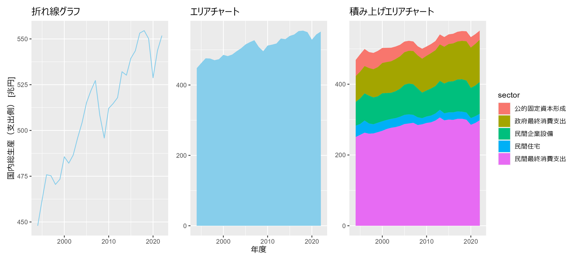
3.2.1 時間推移を可視化する
##### 3.2.1 #####
library(tidyverse)
library(patchwork)

df <- read_csv(
  "https://www.esri.cao.go.jp/jp/sna/data/data_list/sokuhou/files/2023/qe233_2/tables/gaku-jfy2332.csv",
  col_names = FALSE,
  skip = 7,
  col_types = "cnn__nn_nn_______________________"
  ) |>
  drop_na() |>
  mutate( # 各金額を兆円単位に変換
  年度 = str_remove(X1, "/4-3.") |> as.integer(),
  `国内総生産(支出側)` = X2 / 1000,
  民間最終消費支出 = X3 / 1000,
  民間住宅 = X6 / 1000,
  民間企業設備 = X7 / 1000,
  政府最終消費支出 = X9 / 1000,
  公的固定資本形成 = X10 / 1000,
  .keep = "unused"
  )

p1 <- df |>
  ggplot(aes(x = 年度, y = `国内総生産(支出側)`)) +
  geom_line(color="skyblue") +
  labs(title = "折れ線グラフ", y = "国内総生産(支出側) [兆円]") +
  theme(axis.title.x=element_blank())

p2 <- df |>
  ggplot(aes(x = 年度, y = `国内総生産(支出側)`)) +
  geom_area(fill="skyblue") +
  labs(title = "エリアチャート", x = "年度") +
  theme(axis.title.y=element_blank())

p3 <- df |>
  select(!`国内総生産(支出側)`) |>
  pivot_longer(!年度, names_to = "sector", values_to = "val") |>
  mutate(
    sector = factor(sector, levels = rev(c("民間最終消費支出", "民間住宅", "民間企業設備", "政府最終消費支出", "公的固定資本形成")))
    ) |>
  ggplot(aes(x = 年度, y = val, fill = sector)) +
  geom_area() +
  labs(title = "積み上げエリアチャート", x = "年度", y = "国内総生産(支出側) [兆円]") +
  theme(
    axis.title.x=element_blank(),
    axis.title.y=element_blank()
    )

p1 + p2 + p3
3.2.2 複数の時系列データの描画
##### 3.2.2 #####
library(tidyverse)

# データ生成
set.seed(0)

n_days <- 30  # 30日間
n_individuals <- 30  # 個体数
half_n <- as.integer(n_individuals / 2)  # 個体数の半分

# 各個体の活動量期待値を生成
expected_values <- c(
  rnorm(half_n, mean = 50, sd = 5),# 期待値50、標準偏差5の正規分布に従う乱数を生成
  rnorm(half_n, mean = 70, sd = 5)# 期待値70、標準偏差5の正規分布に従う乱数を生成
  )

# 各個体の30日間の活動量を生成
# 期待値expected_values、標準偏差10の正規分布に従う乱数を生成
activity_data <- map(expected_values, \(x) rnorm(n_days, mean = x, sd = 10)) |>
  list_c() |>
  matrix(ncol = 30) |>
  as.data.frame() |>
  set_names(paste0("v", formatC(1:30, width=2, flag="0"))) |>
  mutate(days = 1:30) |>
  pivot_longer(!days) |>
  group_by(days) |>
  mutate(
    ev = expected_values,
    group = c(rep("a", 15), rep("b", 15))
    ) |>
  ungroup()

# 全個体をそれぞれ違う色で描画
p1 <- activity_data |>
  ggplot(aes(x = days, y = value, color = name)) +
  geom_line() +
  labs(title = "すべての個体を異なる色で描画", x = "経過日数", y = "活動量スコア") +
  theme(
    legend.position="none"
    , axis.title.x=element_blank()
    , axis.title.y=element_blank()
  )

# 期待値最大の個体を強調
p2 <- activity_data |>
  mutate(color = if_else(ev == max(expected_values), "a", "b")) |>
  ggplot(aes(x = days, y = value, color = color, group=name)) +
  geom_line() +
  scale_color_manual(values = c("red", "grey")) +
  labs(title = "着目する個体だけ異なる色で描画", x = "経過日数", y = "活動量スコア") +
  theme(
    legend.position="none"
    , axis.title.x=element_blank()
    , axis.title.y=element_blank()
  )

# 15個体のグループごとに描画
p3 <- activity_data |>
  ggplot(aes(x = days, y = value, color = group, group=name)) +
  geom_line() +
  labs(title = "グループごとに異なる色で描画", x = "経過日数", y = "活動量スコア") +
  theme(
    legend.position="none"
    , axis.title.x=element_blank()
    , axis.title.y=element_blank()
  )

# 15個体のグループごとに平均と標準偏差で描画
p4 <- activity_data |>
  summarise(
    mean = mean(value),
    sd = sd(value),
    .by = c(group, days)
  ) |>
  ggplot(aes(x = days, y = mean, color = group, group=group)) +
  geom_ribbon(aes(ymin = mean - sd, ymax = mean + sd, fill = group), alpha=0.2) +
  geom_line() +
  labs(title = "グループごとに平均と標準偏差で描画", x = "経過日数", y = "活動量スコア") +
  theme(
    legend.position="none"
    , axis.title.x=element_blank()
    , axis.title.y=element_blank()
  ) +
  coord_cartesian(ylim = c(20,100))

(p1 + p2 )/(p3 + p4)

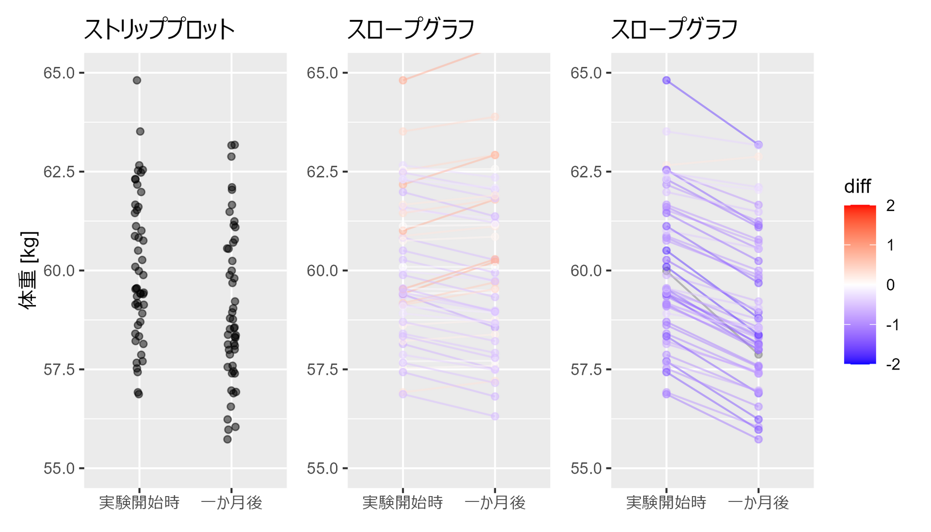
3.2.3 スロープグラフで個々の変化をとらえる
##### 3.2.3 #####
library(tidyverse)
set.seed(0)

# ランダムな体重データを生成
weights_1 <- rnorm(50, 60, 2) # 平均60、分散4の正規分布
weights_2 <- weights_1 + rnorm(50, -1, 0.5) # 平均-1、分散0.25の正規分布
weights_3 <- weights_1 + rnorm(50, 0, 0.5) # 平均0、分散0.25の正規分布(追加)

# データフレームを作成
df <- data.frame(
  Weight = c(weights_1, weights_2),
  Group = factor(
    c(rep("実験開始時", 50), rep("一か月後",50)),
    levels=c("実験開始時", "一か月後")
    ),
  Person = c(seq(50), seq(50))
  )

# 点のみプロット
p1 <- df |>
  ggplot(aes(x = Group, y = Weight)) +
  geom_jitter(width = 0.05, height = 0, alpha = 0.5) +
  labs(x = "期間", y = "体重 [kg]") +
  coord_cartesian(ylim = c(55, 65)) +
  labs(title = "ストリッププロット") +
  theme(axis.title.x=element_blank())

df2 <- df |>
  pivot_wider(names_from = Group, values_from = Weight) |>
  mutate(diff = 一か月後 - 実験開始時) |>
  pivot_longer(!c(Person, diff), names_to = "Group", values_to = "Weight") |>
  mutate(Group = factor(Group, levels=c("実験開始時", "一か月後")))

# スロープグラフ
p2 <- df2 |>
  ggplot(aes(x = Group, y = Weight, group = Person, color = diff)) +
  geom_line(alpha = 0.5) +
  geom_point(alpha = 0.5) +
  scale_color_gradient2(
    midpoint = 0,
    limit = c(-2,2),
    low = "blue",
    mid = "white",
    high = "red",
    guide = "colorbar"
  ) +
  coord_cartesian(ylim = c(55, 65)) +
  labs(title = "スロープグラフ") +
  theme(
    axis.title.x=element_blank()
    , axis.title.y=element_blank()
  )

# スロープグラフ2
p3 <- data.frame(
  Weight = c(weights_1, weights_3),
  Group = factor(
    c(rep("実験開始時", 50), rep("一か月後",50)),
    levels=c("実験開始時", "一か月後")
  ),
  Person = c(seq(50), seq(50))
) |>
  pivot_wider(names_from = Group, values_from = Weight) |>
  mutate(diff = 一か月後 - 実験開始時) |>
  pivot_longer(!c(Person, diff), names_to = "Group", values_to = "Weight") |>
  mutate(Group = factor(Group, levels=c("実験開始時", "一か月後"))) |>
  ggplot(aes(x = Group, y = Weight, group = Person, color = diff)) +
  geom_line(alpha = 0.5) +
  geom_point(alpha = 0.5) +
  scale_color_gradient2(
    midpoint = 0,
    limit = c(-2,2),
    low = "blue",
    mid = "white",
    high = "red",
    guide = "colorbar"
    ) +
  coord_cartesian(ylim = c(55, 65)) +
  labs(title = "スロープグラフ") +
  theme(
    legend.position="none"
    , axis.title.x=element_blank()
    , axis.title.y=element_blank()
  )

p1 + p3 + p2
3.2.4 医薬品の月間販売額を要素分解する
##### 3.2.4 #####
library(tidyverse)
library(forecast)
library(patchwork)

# データの読み込み(インターネットからDL)
df <- read_csv('https://raw.githubusercontent.com/selva86/datasets/master/a10.csv')

# 時系列データに変換
ts_df <- ts(
  df$value,
  start=c(year(df$date[1]), month(df$date[1])),
  frequency=12
  )

# 時系列データを分解
decomposed_add <- decompose(ts_df, type="additive") #加算
decomposed_mlt <- decompose(ts_df, type="multiplicative") #乗算

# プロット作成
p1 <- decomposed_add |>
  autoplot() +
  labs(title = "足し算で分解")

p2 <- decomposed_mlt |>
  autoplot() +
  labs(title = "掛け算で分解")

p1 + p2

第3章2節は以上です。