『データ可視化学入門』をRで書く 1.2 可視化の効果を考える
1.2 可視化の効果を考える
この記事はR言語 Advent Calendar 2023 シリーズ2の2日目の記事です。
qiita.com
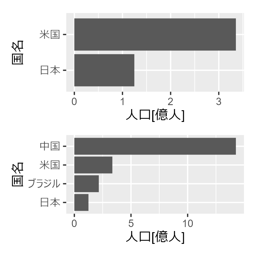
1.2.1 文字情報と視覚情報による提示の違い
##### 1.2.1 #####
library(tidyverse)
library(patchwork)

# データフレームの作成
df <- data.frame(
  Country = c("日本", "ブラジル", "米国", "中国"), # 国のリスト
  Population = c(124620000, 215802222, 335540000, 1425849288) / 100000000 # 人口のリスト
  )

# 米国と日本のみを含む棒グラフの描画
p1 <- df |>
  dplyr::filter(Country %in% c("米国","日本")) |>
  arrange(desc(Population)) |>
  ggplot(aes(x = Population, y = reorder(Country, Population))) +
  geom_col() +
  labs(x = "人口[億人]", y = "国名")

# 四か国を含む棒グラフの描画
p2 <-  df |>
  arrange(desc(Population)) |>
  ggplot(aes(x = Population, y = reorder(Country, Population))) +
  geom_col() +
  labs(x = "人口[億人]", y = "国名")

p1 / p2
1.2.2 2変数データにおけるパターンの発見
##### 1.2.2 #####
data <- data.frame(
  x = c(0.204, 1.07, -0.296, 0.57, 0.637, 0.82, 0.137, -0.046),
  y = c(0.07, 0.57, 0.936, 1.436, 0.32, 1.003, 1.186, 0.503)
  )

square_points <- data.frame(
  x = c(-0.296, 0.57, 1.07, 0.204, -0.296),
  y = c(0.936, 1.436,0.57,0.07, 0.936)
)

ggplot(data, aes(x = x, y = y)) +
  geom_point() +
  geom_path(square_points, mapping = aes(x = x, y = y), color = "red",  linetype = "dashed") +
  coord_fixed() +
  labs(title = "視覚情報による提示")

1.2.3 重要なつながりだけ抜き出す
これはうまくできていない。
都道府県コード順に円環状に並べる方法が分からない。
library(tidyverse)
library(igraph)

pref_ja <- c(
    "北海道", "青森", "岩手", "宮城", "秋田", "山形", "福島", "茨城", "栃木",
    "群馬", "埼玉", "千葉", "東京", "神奈川", "新潟", "富山", "石川", "福井",
    "山梨", "長野", "岐阜", "静岡", "愛知", "三重", "滋賀", "京都", "大阪",
    "兵庫", "奈良", "和歌山", "鳥取", "島根", "岡山", "広島", "山口", "徳島",
    "香川", "愛媛", "高知", "福岡", "佐賀", "長崎", "熊本", "大分", "宮崎",
    "鹿児島", "沖縄"
    )

# データをロード
data_df <- read_csv(
  "https://raw.githubusercontent.com/tkEzaki/data_visualization/main/1%E7%AB%A0/data/matrix.csv"
  )

# 前処理
data_matrix <- data_df[, -1] |>
  as.matrix(nrow = 47)
diag(data_matrix) <- 0
data_matrix <- log1p(data_matrix)
rownames(data_matrix) <- colnames(data_matrix) <- pref_ja

# しきい値を計算
threshold <- quantile(data_matrix, .95)

# しきい値をもとにグラフデータを作る
gData <- data_matrix |>
  as.data.frame() |>
  rownames_to_column(var = "pref") |>
  pivot_longer(!pref) |>
  rename(
    from = pref,
    to = name,
    weight = value
  ) |>
  dplyr::filter(weight >= threshold)

# グラフオブジェクトを生成
g <- graph_from_data_frame(gData, directed=TRUE)
E(g)$width <- E(g)$weight/5
E(g)$color <- rainbow(100, alpha = 0.5)[round(E(g)$weight/max(E(g)$weight) * 100, 0)]

V(g)$label.cex <- 0.5
V(g)$size <- 10

g |>
  plot(
    layout = layout_in_circle,
    edge.curved = 0.5,
    edge.arrow.size = 0.5
    )

1.2.4 全体の関係性パターンを見つける
この図は書籍だと、ラベルが都道府県コード順になっているが、クラスタリングの結果なのでそんなはずはない。
誤植と思われる。
##### 1.2.4 #####
library(tidyverse)
library(pheatmap)

jet.colors <- colorRampPalette(c("#00007F", "blue", "#007FFF", "cyan", "#7FFF7F", "yellow", "#FF7F00", "red", "#7F0000"))

pref_ja <- c(
  "北海道", "青森", "岩手", "宮城", "秋田", "山形", "福島", "茨城", "栃木",
  "群馬", "埼玉", "千葉", "東京", "神奈川", "新潟", "富山", "石川", "福井",
  "山梨", "長野", "岐阜", "静岡", "愛知", "三重", "滋賀", "京都", "大阪",
  "兵庫", "奈良", "和歌山", "鳥取", "島根", "岡山", "広島", "山口", "徳島",
  "香川", "愛媛", "高知", "福岡", "佐賀", "長崎", "熊本", "大分", "宮崎",
  "鹿児島", "沖縄"
)

# データをロード
data_df <- read_csv(
  "https://raw.githubusercontent.com/tkEzaki/data_visualization/main/1%E7%AB%A0/data/matrix.csv"
)

# 前処理
data_matrix <- data_df[, -1] |> as.matrix(nrow = 47)
data_matrix <- log1p(data_matrix)
rownames(data_matrix) <- colnames(data_matrix) <- pref_ja

# ヒートマップ
pheatmap(
  data_matrix,
  clustering_distance_rows = "euclidean",
  clustering_method = "ward.D2",
  border_color = NA,
  color = jet.colors(50)
  )

1.2.5 様々なデータの並べ方
ここは1.2.5と1.2.6をまとめて。
棒グラフの色をグラデーションにしたのはこちらのアレンジ。
library(tidyverse)
library(patchwork)

# データ
data_df <- data.frame(
  code = 1:47,
  prefectures = c(
    "北海道", "青森", "岩手", "宮城", "秋田", "山形", "福島", "茨城", "栃木",
    "群馬", "埼玉", "千葉", "東京", "神奈川", "新潟", "富山", "石川", "福井",
    "山梨", "長野", "岐阜", "静岡", "愛知", "三重", "滋賀", "京都", "大阪",
    "兵庫", "奈良", "和歌山", "鳥取", "島根", "岡山", "広島", "山口", "徳島",
    "香川", "愛媛", "高知", "福岡", "佐賀", "長崎", "熊本", "大分", "宮崎",
    "鹿児島", "沖縄"
    ),
  shipments = c(
    42334, 31897, 56667, 177842, 31295, 39663, 110027, 307752, 173267, 186811,
    579061, 299455, 580563, 368026, 83590, 79298, 42741, 53484, 99220, 136407,
    190720, 240332, 568222, 159106, 136137, 110115, 432778, 291430, 136335,
    35777, 37678, 22612, 108003, 176715, 65910, 29745, 48454, 49767, 20554,
    181309, 95824, 34208, 66604, 41907, 37888, 44466, 5240
    )/1000 # 桁が大きいので千t単位に調整
  )

# 棒グラフ
# 五十音順は割愛、出荷量順を追加
# 出荷量に応じてグラデーションを追加

p1 <- data_df |>
  ggplot(aes(x = reorder(prefectures, code), y = shipments, fill = shipments)) +
  geom_col() +
  labs(x = "", y = "出荷量[千t]", title = "都道府県コード順") +
  scale_fill_gradient(low = "blue", high = "red") +
  theme(
    axis.text.x = element_text(angle = 270, hjust = 1),
    aspect.ratio = 1/3,
    legend.position = "none"
    ) #縦横比

p2 <- data_df |>
  ggplot(aes(x = reorder(prefectures, desc(shipments)), y = shipments, fill = shipments)) +
  geom_col() +
  labs(x = "", y = "出荷量[千t]", title = "出荷量順") +
  scale_fill_gradient(low = "blue", high = "red") +
  theme(
    axis.text.x = element_text(angle = 270, hjust = 1),
    aspect.ratio = 1/3,
    legend.position = "none"
    )

p1 / p2

北海道をずらすのは手間なので割愛。
#地図にデータを可視化する
library(NipponMap)
jet.colors <- colorRampPalette(c("#00007F", "blue", "#007FFF", "cyan", "#7FFF7F", "yellow", "#FF7F00", "red", "#7F0000"))
data_df <- data_df |>
  mutate(
    col_num = round(log(shipments)/max(log(shipments))*100),
    col_name = jet.colors(100)[col_num]
    )

JapanPrefMap(col = data_df$col_name)

第1章2節は以上。