『データ可視化学入門』をRで書く 3.3 2変数の関係をとらえる
3.3 2変数の関係をとらえる
この記事はR言語 Advent Calendar 2023 シリーズ2の11日目の記事です。
qiita.com
3.3.1 ペアプロットによる分布の可視化
##### 3.3.1 #####
library(tidyverse)
library(GGally)
library(palmerpenguins)

penguins |>
  ggpairs(
    columns = c("bill_length_mm", "bill_depth_mm", "flipper_length_mm", "body_mass_g"),
    columnLabels = c("くちばしの長さ [mm]", "くちばしの厚さ [mm]", "ひれの長さ [mm]", "体重 [g]"),
    aes(color = species),
    diag = list(continuous = wrap("densityDiag", alpha = .5))
    )

3.3.2 相関を視るための散布図
##### 3.3.2 #####
library(tidyverse)
library(palmerpenguins)

penguins |>
  ggplot(aes(x = bill_length_mm, y = body_mass_g, color = species, fill = species)) +
  geom_point(alpha=0.3) +
  geom_smooth(method = "lm") +
  labs(x = "くちばしの長さ [mm]", y = "体重 [g]") +
  theme(aspect.ratio = 1)

3.3.3 y = x との比較
nestでもっと効率よく書けそうだが、よく分からなかったのでmapで。
##### 3.3.3 #####
library(tidyverse)
library(palmerpenguins)
library(rsample)
library(MLmetrics)

# データの準備
pen <- penguins |>
  select(body_mass_g, bill_length_mm, bill_depth_mm, flipper_length_mm, species) |>
  drop_na()

pen_list <- split(pen, pen$species)

# 分割
pen_split <- pen_list |>
  map(\(df) initial_split(df, prop = 0.8, strata = "body_mass_g"))

pen_train <-  pen_split |>
  map(\(df) training(df))

pen_test <-  pen_split |>
  map(\(df) testing(df))

# 学習
pen_lm <- pen_train |>
  map(\(df) lm(body_mass_g ~ bill_length_mm + bill_depth_mm + flipper_length_mm, data = df))

# 検証
pen_pred <- pen_lm |>
  map2(pen_test, \(x, y) predict(x, newdata = y))

# 評価(RMSE)
pen_true <- pen_test |> map(pluck("body_mass_g"))
pen_pred |>
  map2_dbl(pen_true, \(y_pred, y_true) RMSE(y_pred, y_true))
# Adelie Chinstrap    Gentoo
# 336.5512  305.2450  313.6054

# 散布図の作成
data.frame(
  y_true = pen_true |> unlist(),
  y_pred = pen_pred |> unlist()
  ) |>
  rownames_to_column(var = "species") |>
  mutate(species = str_remove(species, "[0-9]+")) |>
  ggplot(aes(x = y_true, y = y_pred, color = species)) +
    geom_point(alpha = 0.6) +
    labs(x = "実際の体重 [g]", y = "モデルによる予測 [g]", title = "線形回帰による予測") +
    geom_abline(intercept = 0, slope = 1) +
  coord_cartesian(xlim = c(3000, 6000), ylim = c(3000, 6000)) +
  theme(aspect.ratio = 1)

3.3.4 y = x との比較:その他の例
疑似データ生成がややこしくて、間違ってたらゴメンナサイ
##### 3.3.4 #####
library(tidyverse)
library(patchwork)

set.seed(0)

num_users <- 100 # ユーザー数
replies_sent <- rep(0, num_users) # 送信したリプライ数
replies_received <- rep(0, num_users) # 受信したリプライ数

result <- map(
  1:num_users,
  ~{
    pattern <- sample(c('moderate', 'one_sided_few', 'one_sided_many'), 1) # 3つのパターンからランダムに選択
  if (pattern == 'moderate') {
    replies_sent <- round(runif(1, min = 10, max = 30)) # 10~30回の間でランダムに送信
    replies_received <- replies_sent + round(runif(1, min = -3, max = 3)) # 送信した回数±3回の間でランダムに受信
  }
  else if (pattern == 'one_sided_few') {
    replies_sent <- round(runif(1, min = 0, max = 4)) # 0~3回の間でランダムに送信
    replies_received <- 0
  }
  else { # pattern == 'one_sided_many'
    replies_sent <- round(runif(1, min = 10, max = 30)) # 10~30回の間でランダムに送信
    replies_received <- 0
  }

  c(Sent = replies_sent, Received = replies_received)
}
)

df <- data.frame(do.call("rbind", result))

df2 <- df |>
  mutate(
    Sent = rev(Received),
    Received = rev(Sent)
    )

final_df <- bind_rows(df, df2)

# 体重データを生成
df_weights <- tibble(
  Weight1 = rnorm(50, mean = 60, sd = sqrt(2)), # 平均60、分散2の正規分布,
  Weight2 = Weight1 + rnorm(50, mean = -1, sd = sqrt(0.5)) # 平均-1、分散0.5の正規分布
)

# ggplotを用いたグラフ描画
p1 <- df_weights |>
  ggplot(aes(x = Weight1, y = Weight2)) +
  geom_point(color = "orange") +
  geom_abline(intercept = 0, slope = 1, color = "black") +
  labs(
    title = "同じ量の2時点の比較",
    x = "実験開始時体重 [kg]",
    y = "一か月後体重 [kg]") +
  coord_cartesian(xlim = c(56, 64), ylim = c(56, 64)) +
  theme(aspect.ratio = 1)

p2 <- final_df |>
  ggplot(aes(x = Sent, y = Received)) +
  geom_point(color = "lightblue") +
  geom_abline(intercept = 0, slope = 1, color = "black") +
  labs(
    title = "ペア間の双方向の量の比較",
    x = "送信したリプライ数",
    y = "受信したリプライ数"
    ) +
  coord_cartesian(xlim = c(0, 31), ylim = c(0, 31)) +
  theme(aspect.ratio = 1)

p1 + p2

3.3.5 サンプルサイズが大きいケース
##### 3.3.5 #####
library(tidyverse)
library(patchwork)

set.seed(0)

data <- bind_rows(
  tibble(# 相関の少ないデータの生成
    x = rnorm(100, 25, 10), # 平均25、分散10の正規分布
    y = rnorm(100, 75, 10)  # 平均75、分散10の正規分布
    ),
  tibble(# 相関の多いデータの生成
    x = rnorm(500, 50, 30), # 平均50、分散30の正規分布
    y = 0.5 * x + rnorm(500, 0, 10) # y = 0.5x + ノイズ
    ),
  tibble(
     x = rnorm(400, 25, 20), # 平均25、分散20の正規分布
     y = rnorm(400, 25, 30)  # 平均25、分散30の正規分布
     )
  )

# グラフ生成
p1 <- data |>
  ggplot(aes(x =x, y = y)) +
  geom_point() +
  coord_fixed() +
  labs(title = "不透明マーカー利用")

# 中央のサブプロットに統合データの半透明なマーカー散布図をプロット
p2 <- data |>
  ggplot(aes(x =x, y = y)) +
  geom_point(alpha = 0.1) +
  coord_fixed() +
  labs(title = "半透明マーカー利用")

# ヒートマップを生成
# みためがちょっと違うが2次元ヒストグラムなのでよし
p3 <- data |>
  ggplot(aes(x = x, y = y)) +
  stat_density2d(aes(fill = after_stat(density)), geom="tile", contour=FALSE, n = 20) +
  scale_fill_gradientn(colours = rev(rainbow(10)[1:8])) +
  coord_fixed() +
  labs(title = "ヒートマップ")

p1 + p2 +p3

3.3.6 バブルチャートによる情報提示
##### 3.3.6 #####
library(tidyverse)
library(ggrepel)
library(janitor)

# データの読み込み
df <- read_csv(
  "https://raw.githubusercontent.com/tkEzaki/data_visualization/main/3%E7%AB%A0/data/bubble_chart_data.csv"
  ) |>
  clean_names() |>
  filter(x2021_yr2021 != "..") |>
  mutate(x2021_yr2021 = as.numeric(x2021_yr2021))

region_df <- read_csv(
  "https://raw.githubusercontent.com/tkEzaki/data_visualization/main/3%E7%AB%A0/data/bubble_chart_region_data.csv"
  ) |>
  clean_names()

# データの前処理
df_split <- df |>
  split(df$series_name)

names(df_split) <- c("gdp", "life_exp", "population")

# GDP, Life expectancy, Populationのデータをマージ
data <- df_split$gdp |>
  select(country_name, country_code, x2021_yr2021) |>
  left_join(
    df_split$life_exp |>
      select(country_name, x2021_yr2021),
    by = join_by(country_name),
    suffix = c("_GDP", "_Life_Expectancy")
    ) |>
  left_join(
    df_split$population |>
      select(country_name, x2021_yr2021),
    by = join_by(country_name)
    ) |>
  rename(
    x2021_yr2021_Population = x2021_yr2021
  ) |>
  left_join( #regionをCountry Codeでjoin
    region_df |>
      select(alpha_3, region),
    by = join_by(country_code == alpha_3)
    ) |>
  left_join( #regionをCountry_Nameでjoin
    region_df |>
      select(name, region),
    by = join_by(country_name == name)
  ) |>
  mutate( #region確定
    region = if_else(is.na(region.x), region.y, region.x),
    .keep = "unused"
    ) |>
  drop_na() |> #region無い行を削除
  mutate(# GDP per capita(千ドル)を計算
    GDP_per_capita = x2021_yr2021_GDP / x2021_yr2021_Population / 1000,
    x2021_yr2021_Population = x2021_yr2021_Population / 100000
  )

# 描画
data |>
  ggplot(aes(
    x = GDP_per_capita,
    y = x2021_yr2021_Life_Expectancy,
    color = region,
    size = x2021_yr2021_Population,
    label = country_name
    )) +
  geom_point(alpha = 0.6) +
  scale_size_area(max_size = 11) + #値と面積が比例するように
  geom_text_repel(size = 3) +
  scale_x_log10() +
  labs(
    title = "色や大きさで情報を付加する",
    x = "一人あたりGDP [1,000$](対数軸)",
    y = "平均寿命 [年]",
    size = "人口(10万人)",
    color = "地域"
    ) +
  theme(aspect.ratio = 1)

第3章3節は以上。
『データ可視化学入門』をRで書く 3.2 線で特徴をとらえる
3.2 線で特徴をとらえる
この記事はR言語 Advent Calendar 2023 シリーズ2の10日目の記事です。
qiita.com
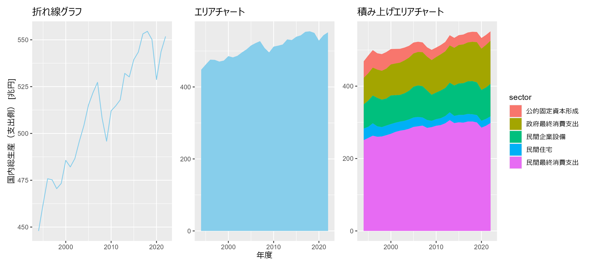
3.2.1 時間推移を可視化する
##### 3.2.1 #####
library(tidyverse)
library(patchwork)

df <- read_csv(
  "https://www.esri.cao.go.jp/jp/sna/data/data_list/sokuhou/files/2023/qe233_2/tables/gaku-jfy2332.csv",
  col_names = FALSE,
  skip = 7,
  col_types = "cnn__nn_nn_______________________"
  ) |>
  drop_na() |>
  mutate( # 各金額を兆円単位に変換
  年度 = str_remove(X1, "/4-3.") |> as.integer(),
  `国内総生産(支出側)` = X2 / 1000,
  民間最終消費支出 = X3 / 1000,
  民間住宅 = X6 / 1000,
  民間企業設備 = X7 / 1000,
  政府最終消費支出 = X9 / 1000,
  公的固定資本形成 = X10 / 1000,
  .keep = "unused"
  )

p1 <- df |>
  ggplot(aes(x = 年度, y = `国内総生産(支出側)`)) +
  geom_line(color="skyblue") +
  labs(title = "折れ線グラフ", y = "国内総生産(支出側) [兆円]") +
  theme(axis.title.x=element_blank())

p2 <- df |>
  ggplot(aes(x = 年度, y = `国内総生産(支出側)`)) +
  geom_area(fill="skyblue") +
  labs(title = "エリアチャート", x = "年度") +
  theme(axis.title.y=element_blank())

p3 <- df |>
  select(!`国内総生産(支出側)`) |>
  pivot_longer(!年度, names_to = "sector", values_to = "val") |>
  mutate(
    sector = factor(sector, levels = rev(c("民間最終消費支出", "民間住宅", "民間企業設備", "政府最終消費支出", "公的固定資本形成")))
    ) |>
  ggplot(aes(x = 年度, y = val, fill = sector)) +
  geom_area() +
  labs(title = "積み上げエリアチャート", x = "年度", y = "国内総生産(支出側) [兆円]") +
  theme(
    axis.title.x=element_blank(),
    axis.title.y=element_blank()
    )

p1 + p2 + p3
3.2.2 複数の時系列データの描画
##### 3.2.2 #####
library(tidyverse)

# データ生成
set.seed(0)

n_days <- 30  # 30日間
n_individuals <- 30  # 個体数
half_n <- as.integer(n_individuals / 2)  # 個体数の半分

# 各個体の活動量期待値を生成
expected_values <- c(
  rnorm(half_n, mean = 50, sd = 5),# 期待値50、標準偏差5の正規分布に従う乱数を生成
  rnorm(half_n, mean = 70, sd = 5)# 期待値70、標準偏差5の正規分布に従う乱数を生成
  )

# 各個体の30日間の活動量を生成
# 期待値expected_values、標準偏差10の正規分布に従う乱数を生成
activity_data <- map(expected_values, \(x) rnorm(n_days, mean = x, sd = 10)) |>
  list_c() |>
  matrix(ncol = 30) |>
  as.data.frame() |>
  set_names(paste0("v", formatC(1:30, width=2, flag="0"))) |>
  mutate(days = 1:30) |>
  pivot_longer(!days) |>
  group_by(days) |>
  mutate(
    ev = expected_values,
    group = c(rep("a", 15), rep("b", 15))
    ) |>
  ungroup()

# 全個体をそれぞれ違う色で描画
p1 <- activity_data |>
  ggplot(aes(x = days, y = value, color = name)) +
  geom_line() +
  labs(title = "すべての個体を異なる色で描画", x = "経過日数", y = "活動量スコア") +
  theme(
    legend.position="none"
    , axis.title.x=element_blank()
    , axis.title.y=element_blank()
  )

# 期待値最大の個体を強調
p2 <- activity_data |>
  mutate(color = if_else(ev == max(expected_values), "a", "b")) |>
  ggplot(aes(x = days, y = value, color = color, group=name)) +
  geom_line() +
  scale_color_manual(values = c("red", "grey")) +
  labs(title = "着目する個体だけ異なる色で描画", x = "経過日数", y = "活動量スコア") +
  theme(
    legend.position="none"
    , axis.title.x=element_blank()
    , axis.title.y=element_blank()
  )

# 15個体のグループごとに描画
p3 <- activity_data |>
  ggplot(aes(x = days, y = value, color = group, group=name)) +
  geom_line() +
  labs(title = "グループごとに異なる色で描画", x = "経過日数", y = "活動量スコア") +
  theme(
    legend.position="none"
    , axis.title.x=element_blank()
    , axis.title.y=element_blank()
  )

# 15個体のグループごとに平均と標準偏差で描画
p4 <- activity_data |>
  summarise(
    mean = mean(value),
    sd = sd(value),
    .by = c(group, days)
  ) |>
  ggplot(aes(x = days, y = mean, color = group, group=group)) +
  geom_ribbon(aes(ymin = mean - sd, ymax = mean + sd, fill = group), alpha=0.2) +
  geom_line() +
  labs(title = "グループごとに平均と標準偏差で描画", x = "経過日数", y = "活動量スコア") +
  theme(
    legend.position="none"
    , axis.title.x=element_blank()
    , axis.title.y=element_blank()
  ) +
  coord_cartesian(ylim = c(20,100))

(p1 + p2 )/(p3 + p4)

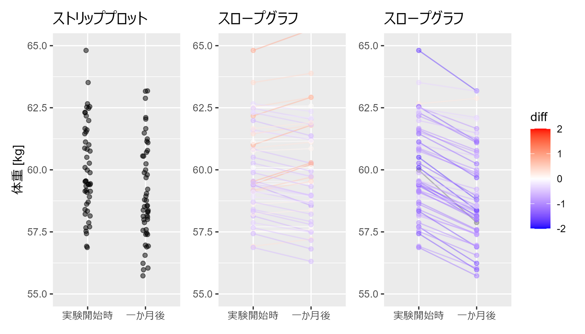
3.2.3 スロープグラフで個々の変化をとらえる
##### 3.2.3 #####
library(tidyverse)
set.seed(0)

# ランダムな体重データを生成
weights_1 <- rnorm(50, 60, 2) # 平均60、分散4の正規分布
weights_2 <- weights_1 + rnorm(50, -1, 0.5) # 平均-1、分散0.25の正規分布
weights_3 <- weights_1 + rnorm(50, 0, 0.5) # 平均0、分散0.25の正規分布(追加)

# データフレームを作成
df <- data.frame(
  Weight = c(weights_1, weights_2),
  Group = factor(
    c(rep("実験開始時", 50), rep("一か月後",50)),
    levels=c("実験開始時", "一か月後")
    ),
  Person = c(seq(50), seq(50))
  )

# 点のみプロット
p1 <- df |>
  ggplot(aes(x = Group, y = Weight)) +
  geom_jitter(width = 0.05, height = 0, alpha = 0.5) +
  labs(x = "期間", y = "体重 [kg]") +
  coord_cartesian(ylim = c(55, 65)) +
  labs(title = "ストリッププロット") +
  theme(axis.title.x=element_blank())

df2 <- df |>
  pivot_wider(names_from = Group, values_from = Weight) |>
  mutate(diff = 一か月後 - 実験開始時) |>
  pivot_longer(!c(Person, diff), names_to = "Group", values_to = "Weight") |>
  mutate(Group = factor(Group, levels=c("実験開始時", "一か月後")))

# スロープグラフ
p2 <- df2 |>
  ggplot(aes(x = Group, y = Weight, group = Person, color = diff)) +
  geom_line(alpha = 0.5) +
  geom_point(alpha = 0.5) +
  scale_color_gradient2(
    midpoint = 0,
    limit = c(-2,2),
    low = "blue",
    mid = "white",
    high = "red",
    guide = "colorbar"
  ) +
  coord_cartesian(ylim = c(55, 65)) +
  labs(title = "スロープグラフ") +
  theme(
    axis.title.x=element_blank()
    , axis.title.y=element_blank()
  )

# スロープグラフ2
p3 <- data.frame(
  Weight = c(weights_1, weights_3),
  Group = factor(
    c(rep("実験開始時", 50), rep("一か月後",50)),
    levels=c("実験開始時", "一か月後")
  ),
  Person = c(seq(50), seq(50))
) |>
  pivot_wider(names_from = Group, values_from = Weight) |>
  mutate(diff = 一か月後 - 実験開始時) |>
  pivot_longer(!c(Person, diff), names_to = "Group", values_to = "Weight") |>
  mutate(Group = factor(Group, levels=c("実験開始時", "一か月後"))) |>
  ggplot(aes(x = Group, y = Weight, group = Person, color = diff)) +
  geom_line(alpha = 0.5) +
  geom_point(alpha = 0.5) +
  scale_color_gradient2(
    midpoint = 0,
    limit = c(-2,2),
    low = "blue",
    mid = "white",
    high = "red",
    guide = "colorbar"
    ) +
  coord_cartesian(ylim = c(55, 65)) +
  labs(title = "スロープグラフ") +
  theme(
    legend.position="none"
    , axis.title.x=element_blank()
    , axis.title.y=element_blank()
  )

p1 + p3 + p2
3.2.4 医薬品の月間販売額を要素分解する
##### 3.2.4 #####
library(tidyverse)
library(forecast)
library(patchwork)

# データの読み込み(インターネットからDL)
df <- read_csv('https://raw.githubusercontent.com/selva86/datasets/master/a10.csv')

# 時系列データに変換
ts_df <- ts(
  df$value,
  start=c(year(df$date[1]), month(df$date[1])),
  frequency=12
  )

# 時系列データを分解
decomposed_add <- decompose(ts_df, type="additive") #加算
decomposed_mlt <- decompose(ts_df, type="multiplicative") #乗算

# プロット作成
p1 <- decomposed_add |>
  autoplot() +
  labs(title = "足し算で分解")

p2 <- decomposed_mlt |>
  autoplot() +
  labs(title = "掛け算で分解")

p1 + p2

第3章2節は以上です。
『データ可視化学入門』をRで書く 3.1 分布の特徴をとらえる
3.1 分布の特徴をとらえる
この記事はR言語 Advent Calendar 2023 シリーズ2の9日目の記事です。
qiita.com
3.1.1 基本的な分布の特徴
##### 3.1.1 #####
library(tidyverse)
library(patchwork)

set.seed(0) # 乱数のシードを設定(再現性のため)

my_plot <- function(data, title){
  data |>
    ggplot(aes(x = val, fill = name)) +
    geom_histogram(position = "identity",alpha=0.5, color = "black") +
    labs(title = title) +
    theme(
      legend.position="none",
      axis.title.x=element_blank(),
      axis.title.y=element_blank()
    )
}

# 中央傾向:平均値が0と10の二つの分布
# 平均0、標準偏差1の正規分布に従う乱数を1000個生成
# 平均5、標準偏差1の正規分布に従う乱数を1000個生成
p1 <- bind_rows(
  data.frame(val = rnorm(1000, mean = 0, sd = 1), name = "a"),
  data.frame(val = rnorm(1000, mean = 5, sd = 1), name = "b")
  ) |>
  my_plot("ピークの位置")

# 分散:分散が大きい分布と小さい分布
# 平均5、標準偏差1の正規分布に従う乱数を1000個生成
# 平均5、標準偏差3の正規分布に従う乱数を1000個生成
p2 <- bind_rows(
  data.frame(val = rnorm(1000, mean = 5, sd = 1), name = "a"),
  data.frame(val = rnorm(1000, mean = 5, sd = 3), name = "b")
  ) |>
  my_plot("広がりの度合い")

# 形状:正規分布、左寄せの分布
# 平均5、標準偏差1の正規分布に従う乱数を1000個生成
# 形状パラメータ2、尺度パラメータ2のガンマ分布に従う乱数を1000個生成
p3 <- bind_rows(
  data.frame(val = rnorm(1000, mean = 5, sd = 1) , name = "a"),
  data.frame(val = rgamma(1000, shape = 2, scale = 2) , name = "b")
) |>
  my_plot("分布の形状")

# ピーク:ピーク一つとピーク二つの分布
# 平均5、標準偏差1の正規分布に従う乱数を1000個生成
# 平均3、標準偏差1の正規分布と平均7、標準偏差1の正規分布に従う乱数を500個ずつ生成
p4 <- bind_rows(
  data.frame(val = rnorm(1000, mean = 5, sd = 1) , name = "a"),
  data.frame(val = c(rnorm(500, mean = 3, sd = 1), rnorm(500, mean = 7, sd = 1)), name = "b")
) |>
  my_plot("ピークの数と位置")

# 外れ値:ごく少量の大きい外れ値が含まれている分布と含まれていない分布
# 平均5、標準偏差1の正規分布に従う乱数を995個と平均50、標準偏差5の正規分布に従う乱数を5個生成
# 平均5、標準偏差1の正規分布に従う乱数を1000個生成
p5 <- bind_rows(
  data.frame(val = c(rnorm(995, mean = 5, sd = 1), rnorm(5, mean = 50, sd = 5)), name = "a"),
  data.frame(val = rnorm(1000, mean = 5, sd = 1), name = "b")
) |>
  my_plot("外れ値")

# 外れ値:外れ値が多少ある分布とほぼない分布
# 平均5、標準偏差1の正規分布に従う乱数を1000個生成
# 平均5、標準偏差1の正規分布に従う乱数を975個と平均15、標準偏差1の正規分布に従う乱数を25個生成
p6 <- bind_rows(
  data.frame(val = rnorm(1000, mean = 5, sd = 1) , name = "a"),
  data.frame(val = c(rnorm(975, mean = 5, sd = 1), rnorm(25, mean = 15, sd = 1)), name = "b")
) |>
  my_plot("外れ値?")

(p1 + p2 + p3) / (p4 + p5 + p6)

3.1.2 ヒストグラムの形状とビンの定義
##### 3.1.2 #####
library(tidyverse)
library(patchwork)

set.seed(0) # 乱数のシードを設定(再現性のため)

data_df <- data.frame(data = rnorm(100, 0, 1)) # 観測結果をデータフレームに変換

my_plot2 <- function(data, title, binwidth = 0.4, boundary = 0){
  data |>
    ggplot(aes(x=data)) +
    geom_histogram(
      aes(y = after_stat(density)), fill = "blue",
      binwidth = binwidth, boundary = boundary
      ) +
    stat_function(fun=dnorm, color="red", linewidth = 1, linetype=2, args=list(mean=0)) +
    labs(title = title) +
    theme(
      legend.position="none",
      axis.title.x=element_blank(),
      axis.title.y=element_blank(),
      aspect.ratio = 1
    )
}

p1 <- data_df |>
  my_plot2("ビン幅 = 0.8", binwidth =0.8)

p2 <- data_df |>
  my_plot2("ビン幅 = 0.4", binwidth =0.4)

p3 <- data_df |>
  my_plot2("ビン幅 = 0.08", binwidth =0.08)

p4 <- data_df |>
  my_plot2("boundary = 0", boundary = 0)

p5 <- data_df |>
  my_plot2("boundary = 0.1", boundary = 0.1)

p6 <- data_df |>
  my_plot2("boundary = 0.2", binwidth =0.2)

(p1 + p2 + p3) / (p4 + p5 + p6)

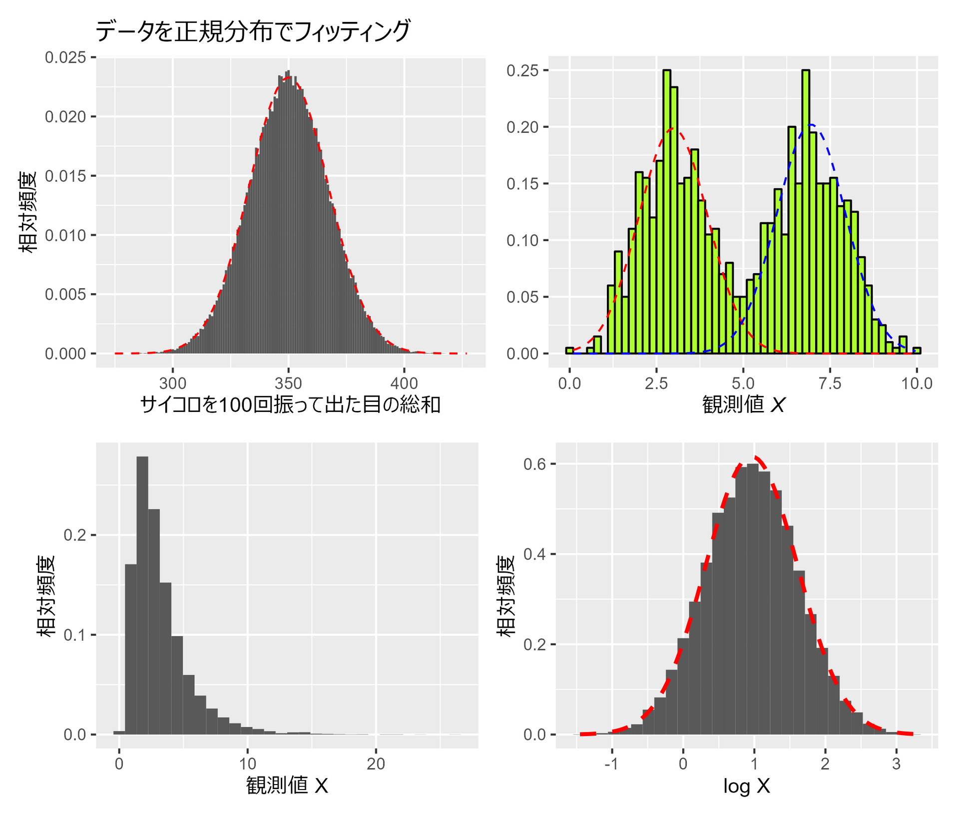
3.1.3 正規分布との比較
##### 3.1.3 #####
library(tidyverse)
library(mclust) # 混合ガウシアンモデルのパッケージ
library(MASS)
library(patchwork)

set.seed(0) # 乱数のシードを設定(再現性のため)

# サイコロを100回振った時の出目の総和を10万回計算
# 元は1000回となっているがキレイな分布にならないので増やしてます
roll_dice <- function(n = 100, repeat_num = 100000) {
  rowSums(
    matrix(
      sample.int(6, size = n*repeat_num, replace = TRUE),
      ncol = n
      )
    )
}

# ヒストグラムの作成
hist_data <- roll_dice()

p1 <- data.frame(x = hist_data) |>
  ggplot(aes(x=x)) +
  geom_histogram(aes(y=after_stat(density)), binwidth=1) +
  stat_function(fun=dnorm, args=list(mean=mean(hist_data), sd=sd(hist_data)), color='red', linetype="dashed") +
  labs(title = "データを正規分布でフィッティング", x="サイコロを100回振って出た目の総和", y="相対頻度") +
  theme(aspect.ratio = 4/5)

# 乱数のシードを設定(再現性のため)
set.seed(0)

# ピーク一つとピーク二つの分布
#平均3, 標準偏差1 と 平均7, 標準偏差1 の正規分布に従う乱数を500個ずつ生成
data4_b <- c(
  rnorm(500, mean = 3, sd = 1),
  rnorm(500, mean = 7, sd = 1)
  )

# 混合ガウシアンモデルのパラメータを推定
gmm <- Mclust(data4_b, G=2)

# データと混合ガウシアンモデルの結果をプロット
p2 <- data.frame(x = data4_b) |>
  ggplot(aes(x=x)) +
  geom_histogram(aes(y=after_stat(density)), binwidth=0.2, colour="black", fill="greenyellow") +
  stat_function(
    fun = function(x) gmm$parameters$pro[1] * dnorm(x, gmm$parameters$mean[1], sqrt(gmm$parameters$variance$sigma)),
    linetype = "dashed",
    color = "red"
    ) +
  stat_function(
    fun = function(x) gmm$parameters$pro[2]*dnorm(x, gmm$parameters$mean[2], sqrt(gmm$parameters$variance$sigma)),
    linetype = "dashed",
    color = "blue"
    ) +
  labs(
    titel = "データから2つの正規分布を推定",
    x = expression(paste("観測値 ", italic("X")))
    ) +
  theme(
    aspect.ratio = 4/5,
    axis.title.y=element_blank()
    )

set.seed(0) # 乱数のシードを設定(再現性のため)

# サンプルを生成
lognorm_samples <- rlnorm(10000, meanlog = 0.954, sdlog = 0.65)
log_lognorm_samples <- log(lognorm_samples) # 対数変換

# 平均と標準偏差を推定
lognorm_fit <- fitdistr(log_lognorm_samples, densfun = "normal")

p3 <- data.frame(x = lognorm_samples) |>
  ggplot(aes(x = x)) +
  geom_histogram(aes(y = after_stat(density))) +
  labs(x = "観測値 X", y = "相対頻度") +
  theme(aspect.ratio = 4/5)

p4 <- data.frame(x = log_lognorm_samples) |>
  ggplot(aes(x = x)) +
  geom_histogram(aes(y = after_stat(density))) +
  labs(x = "log X", y = "相対頻度") +
  stat_function(
    fun=dnorm,
    color="red",
    size = 1,
    linetype=2,
    args=list(mean=lognorm_fit$estimate[1], sd=lognorm_fit$estimate[2])
    )  +
  theme(aspect.ratio = 4/5)

(p1 + p2) / (p3 + p4)
3.1.4 様々な理論分布
##### 3.1.4 #####
library(tidyverse)
library(patchwork)

# 描画用一時関数
my_plot_line <- function(df, color, title) {
    ggplot(df, aes(x = x, y = y)) +
    geom_line(color = color, linewidth = 2) +
    labs(title = title) +
    theme(
      axis.title.x=element_blank(),
      axis.title.y=element_blank()
    )
}

my_plot_point <- function(df, color, title) {
  ggplot(df, aes(x = x, y = y)) +
    geom_point(color = color) +
    labs(title = title) +
    theme(
      axis.title.x=element_blank(),
      axis.title.y=element_blank()
    )
}

# 一様分布
uni_p <- tibble(
  x = seq(-1, 1, length.out = 1000),
  y = dunif(x, min = -1, max = 1)
  ) |>
  my_plot_line("orange", "一様分布")

# 正規分布
norm_p <- tibble(
  x = seq(-4, 4, length.out = 1000),
  y = dnorm(x)
)  |>
  my_plot_line("red", "正規分布")

# 二項分布
bin_p <- tibble(
  x = 0:10,
  y = dbinom(0:10, size=10, prob=0.5)
  ) |>
  my_plot_point("blue", "二項分布")

# ポアソン分布
poi_p <- tibble(
  x = 0:9,
  y = dpois(0:9, lambda = 3)
) |>
  my_plot_point("forestgreen", "ポアソン分布")

# 指数分布
exp_p <- tibble(
  x = seq(0, 10, length.out = 1000),
  y = dexp(x)
)  |>
  my_plot_point("purple", "指数分布")

# ガンマ分布
gam_p <- tibble(
  x = seq(0, 10, length.out = 1000),
  y = dgamma(x, 5)
) |>
  my_plot_point("brown", "ガンマ分布")

# ワイブル分布
wei_p <- tibble(
  x = seq(0.01, 2, length.out = 1000),
  y = dweibull(x, 1.5)
)  |>
  my_plot_point("grey", "ワイブル分布")

# 対数正規分布
ln_p <- tibble(
  x = seq(0.01, 10, length.out = 1000),
  y = dlnorm(x)
)  |>
  my_plot_line("pink", "対数正規分布")

# パレート分布
paretofunc <- function(x, alpha = 5, xm = 1) alpha * (xm^alpha) / (x^(alpha+1))
pare_p <- tibble(
  x = seq(1, 4, length.out = 1000),
  y = paretofunc(x)
)  |>
  my_plot_line("cyan", "パレート分布")

# グラフを並べて表示
uni_p + norm_p + bin_p + poi_p + exp_p + gam_p + wei_p + ln_p + pare_p +
  plot_layout(ncol = 2)

3.1.5 累積分布でデータを視る
##### 3.1.5 #####
# 正規乱数を生成するためのシードを設定
library(tidyverse)
set.seed(0)

# 正規分布から100点と500点のサンプルを生成
samples <- rnorm(600)

p1 <- tibble(
  x = samples[1:100],
  fill = if_else(x >= quantile(x, 0.8), "80%点以上", "80%点未満")
  ) |>
  ggplot(aes(x = x, fill = fill)) +
  geom_histogram() +
  labs(x = "観測値", y = "頻度")

p2 <- tibble(x = samples[1:100]) |>
  ggplot(aes(x = x)) +
  stat_ecdf(pad = FALSE, color = "blue") +
  stat_function(fun=pnorm, color = "red", linetype = 2) +
  labs(title = "サンプルサイズ=100", x = "観測値", y = "累積相対頻度")

p3 <- tibble(x = samples[101:500]) |>
  ggplot(aes(x = x)) +
  stat_ecdf(pad = FALSE, color = "blue") +
  stat_function(fun=pnorm, color = "red", linetype = 2) +
  labs(title = "サンプルサイズ=500", x = "観測値", y = "累積相対頻度")

(p1 + plot_spacer()) / (p2 + p3)

第3章1節は以上です。
『データ可視化学入門』をRで書く 2.3 標本を視えるようにする
2.3 標本を視えるようにする
この記事はR言語 Advent Calendar 2023 シリーズ2の7日目の記事です。
[qiita.com
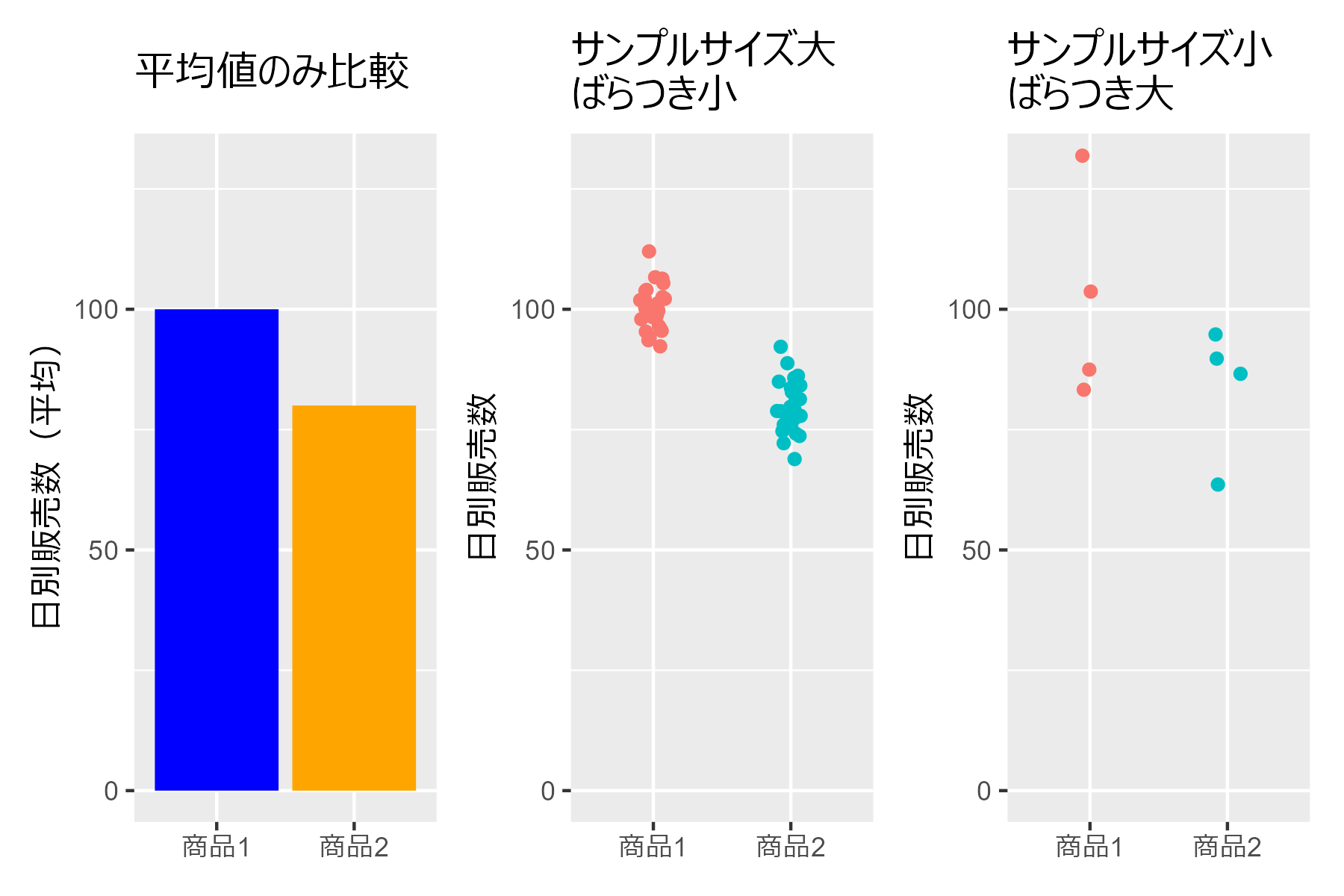
2.3.1 平均値の棒グラフの危険性
##### 2.3.1 #####
library(tidyverse)

p1 <- data.frame(
  x = c("商品1","商品2"),
  avg = c(100, 80)
  ) |>
  ggplot(aes(x = x, y = avg)) +
  geom_col(fill = c("blue","orange")) +
  theme(axis.title.x = element_blank()) +
  labs(y = "日別販売数(平均)", title = "平均値のみ比較") +
  coord_cartesian(ylim = c(0, 130))

# データの生成
n_small <- 30
n_large <- 4
set.seed(0)
df_small_var <- bind_rows(
  data.frame(
    商品 = rep("商品1", n_small),
    日別販売数 = rnorm(n_small, 100, 5) # 平均100、標準偏差5の正規分布に従う乱数を30個生成
    ),
  data.frame(
    商品 = rep("商品2", n_small),
    日別販売数 = rnorm(n_small, 80, 5) # 平均80、標準偏差5の正規分布に従う乱数を30個生成
    )
  )

p2 <- df_small_var |>
  ggplot(aes(x=商品, y=日別販売数, color = 商品)) +
  geom_jitter(width = 0.1, height = 0) +
  theme(
    axis.title.x = element_blank(),
    legend.position = "none"
    )+
  labs(title = "サンプルサイズ大\nばらつき小") +
  coord_cartesian(ylim = c(0, 130))

set.seed(1)
df_large_var <- bind_rows(
  data.frame(
    商品 = rep("商品1", n_large),
    日別販売数 = rnorm(n_large, 100, 20) # 平均100、標準偏差20の正規分布に従う乱数を4個生成
  ),
  data.frame(
    商品 = rep("商品2", n_large),
    日別販売数 = rnorm(n_large, 80, 20) # 平均80、標準偏差20の正規分布に従う乱数を4個生成
  )
)

p3 <- df_large_var |>
  ggplot(aes(x=商品, y=日別販売数, color = 商品)) +
  geom_jitter(width = 0.1, height = 0) +
  theme(
    axis.title.x = element_blank(),
    legend.position = "none"
  )+
  labs(title = "サンプルサイズ小\nばらつき大") +
  coord_cartesian(ylim = c(0, 130))

p1 + p2 + p3
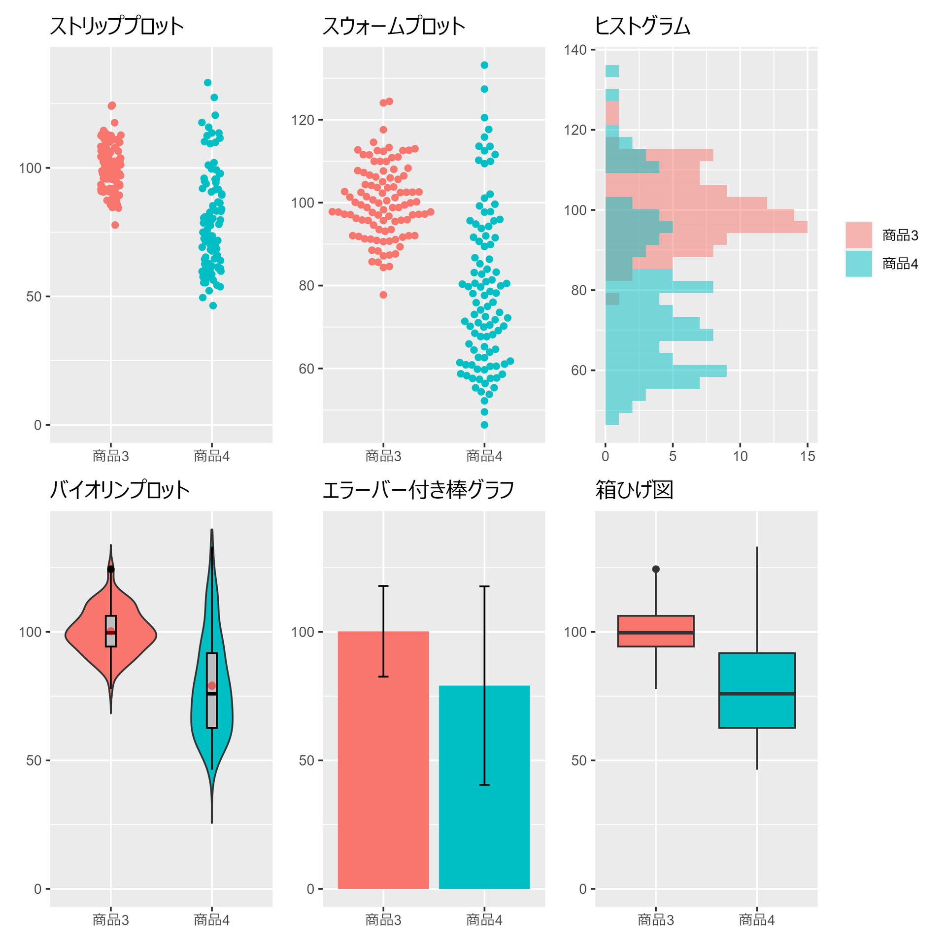
2.3.2 様々な標本の可視化
##### 2.3.2 #####
library(tidyverse)
library(ggbeeswarm)
library(Hmisc)
library(patchwork)

set.seed(0) # 乱数のシードを設定(再現性のため)
num_samples <- 100 # サンプルサイズ

# データフレームの生成
data <- data.frame(
  Value = c(
    rnorm(num_samples, 100, 10), # 平均100、標準偏差10の正規分布
    rnorm(num_samples, 80, 20)   # 平均80、標準偏差20の正規分布
    ),
  Category = c(
    rep("商品3", num_samples),
    rep("商品4", num_samples)
    )
  )

# ggplot2の基本設定
plt <- data |>
  ggplot(aes(x=Category, y=Value)) +
  theme(
    axis.title.x = element_blank(),
    axis.title.y = element_blank(),
    legend.position = "none"
  )

# ストリッププロット (Dodge position)
p1 <- plt +
  geom_jitter(aes(color = Category), height = 0, width = 0.1)+
  scale_y_continuous(limits = c(0, 140)) +
  labs(title = "ストリッププロット")

# スウォームプロット
p2 <- plt +
  geom_beeswarm(aes(color = Category),cex = 3) +
  labs(title = "スウォームプロット")

# ヒストグラム
p3 <- data |>
  ggplot(aes(y=Value, fill=Category)) +
  geom_histogram(alpha=0.5, position='identity') +
  labs(title = "ヒストグラム") +
  theme(
    axis.title.x = element_blank(),
    axis.title.y = element_blank(),
    legend.title = element_blank()
  )

# バイオリンプロット
p4 <- plt +
  geom_violin(aes(fill = Category),trim=FALSE) +
  geom_boxplot(width = .1, fill = "gray", color="black")+
  stat_summary(fun = mean, geom = "point",
               shape =16, size = 2, color = "red", alpha = 0.5)+
  scale_y_continuous(limits = c(0, 140))+
  labs(title = "バイオリンプロット")

# エラーバー付き棒グラフ
p5 <- plt +
  stat_summary(aes(fill = Category),fun = "mean", geom = "bar") +
  stat_summary(geom = "errorbar",
               fun.data = "mean_sdl",
               width = 0.1, color = "black") +
  scale_y_continuous(limits = c(0, 140))+
  labs(title = "エラーバー付き棒グラフ")

# 箱ひげ図
p6 <- plt +
  geom_boxplot(aes(fill = Category)) +
  scale_y_continuous(limits = c(0, 140))+
  labs(title = "箱ひげ図")

(p1 + p2 + p3) / (p4 + p5 + p6)
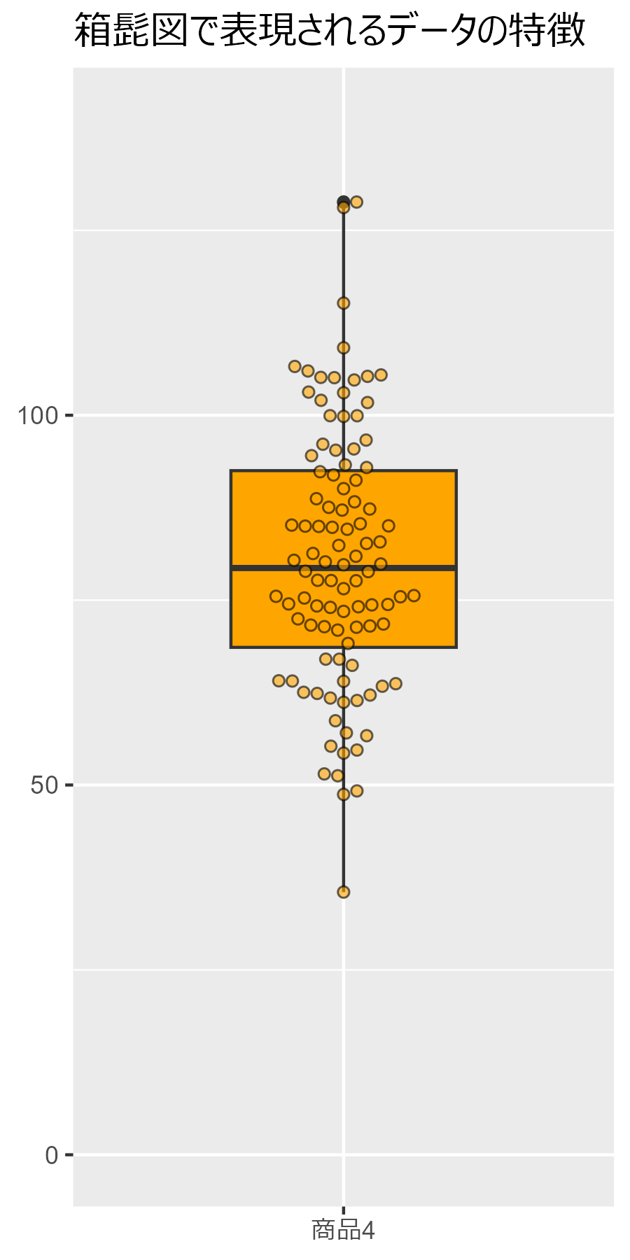
2.3.3 箱髭図の構成要素
##### 2.3.3 #####
library(tidyverse)
library(ggbeeswarm)

set.seed(0)# シード設定

data.frame(
  Value = rnorm(100, mean=80, sd=20),
  Category = "商品4"
  ) |>
  ggplot(aes(x=Category, y=Value)) +
  geom_boxplot(fill = "orange", width = 0.5) +
  geom_beeswarm(shape = 21, cex = 3, fill = "orange", alpha=0.6) +
  coord_cartesian(ylim = c(0,140)) +
  labs(title = "箱髭図で表現されるデータの特徴") +
  theme(
    legend.position="none",
    axis.title.x=element_blank(),
    axis.title.y=element_blank()
    )
第2章3節は以上です。
『データ可視化学入門』をRで書く 2.2 大きさを比較する
2.2 大きさを比較する
この記事はR言語 Advent Calendar 2023 シリーズ2の5日目の記事です。
qiita.com
2.2.1 棒グラフの例
##### 2.2.1 #####
library(tidyverse)
library(patchwork)

#データの定義
week <- c("月曜", "火曜", "水曜", "木曜", "金曜", "土曜", "日曜")
data <- data.frame(
  week = factor(week, levels = week),
  sales = c(30, 25, 35, 28, 22, 34, 35),
  card_member = c(20, 13, 20, 14, 14, 20, 25),
  non_member = c(10, 12, 15, 14, 8, 14, 10)
)

#基本的な棒グラフの作成
p1 <- data |>
  ggplot(aes(x = week, y = sales)) +
  geom_col(fill = "blue") +
  theme(axis.title.x = element_blank(), legend.position = "none") +
  labs(title = "基本的な棒グラフ",  x= "", y = "売上 [万円]")

#積み上げ棒グラフの作成
data_long <- data |>
  select(!sales) |>
  pivot_longer(!week, names_to = "membership", values_to = "sales")

p2 <- data_long |>
  ggplot(aes(x=week, y=sales, fill=membership)) +
  geom_col(position = "stack") +
  theme(
    axis.title.x = element_blank(),
    legend.position = "none"
    ) +
  labs(y = "売上 [万円]", title = "積み上げ棒グラフ")

#水平棒グラフの作成
p3 <- data_long |>
  ggplot(aes(x=week, y=sales, fill=membership)) +
  geom_col(position = "dodge") +
  coord_flip() +
  theme(legend.title = element_blank()) +
  labs(y = "売上 [万円]", x = "", title = "水平棒グラフ/集団棒グラフ") +
  scale_fill_hue(name = "カード会員", labels = c(card_member = "会員", non_member ="非会員") )

#プロットの並べ方設定
(p1 + p2) / p3

2.2.2 折れ線グラフの例
##### 2.2.2 #####
library(tidyverse)
library(patchwork)

# データの生成
set.seed(0)
week <- c("月曜日", "火曜日", "水曜日", "木曜日", "金曜日", "土曜日", "日曜日")
df <- data.frame(
  曜日 = factor(week, levels = week),
  Aさん = rnorm(7, 36, 0.2),
  Bさん = rnorm(7, 36, 0.2)
  ) |>
  pivot_longer(!曜日) |>
  ggplot(aes(x=曜日, y = value, group = name, color = name, linetype = name, shape = name)) +
  geom_line() +
  geom_point() +
  theme(
    legend.title = element_blank()
    ) +
    labs(y = "体温[℃]", title="折れ線グラフ") +
  theme(aspect.ratio = 1/2)

2.2.3 見やすさのための折れ線
##### 2.2.3 #####
library(tidyverse)
library(patchwork)

# データの生成
set.seed(0) # 乱数のシードを設定(再現性のため)
people <- LETTERS[1:7] # 人のリスト
df <- data.frame(
  人 = c(people, people),
  temp = rnorm(14, mean = 36.0, sd = 0.2),
  time_of_day = c(rep("夕方", 7), rep("早朝", 7))
  )

# マーカーのみの折れ線グラフをプロット
p1 <- df |>
  ggplot(aes(x = 人, y = temp, group = time_of_day, shape = time_of_day, color = time_of_day)) +
  geom_point() +
  labs(
    title = "マーカーのみプロット",
    x = "",
    y = "体温 [℃]"
    ) +
  theme(
    aspect.ratio = 1,
    legend.title = element_blank()
    )

p2 <- p1 + geom_line() + labs(title = "見やすさのための補助の折れ線を追加")

p1 + p2

第2章2節は以上。
『データ可視化学入門』をRで書く 2.1 数量と図形の大きさを紐づける
2.1 数量と図形の大きさを紐づける
この記事はR言語 Advent Calendar 2023 シリーズ2の4日目の記事です。
qiita.com
2.1.1 図形の大きさと数量を紐づける
##### 2.1.1 #####
library(tidyverse)
library(ggpubr)

label <- c("支持する", "支持しない", "どちらとも\nいえない", "無回答")
data.frame(
  label=factor(label, levels = rev(label)),
  data=c(40, 32, 25, 3)
  ) |>
  ggdonutchart(
    x = "data",
    label = "label",
    fill = "label",
    palette = c("darkgray", "lightgray", "red", "blue")
    ) +
  theme(legend.position = "none")

2.1.2 ワードクラウドを用いた「頻度と見た目の大きさ」の紐づけ
##### 2.1.2 #####
library(tidyverse)
library(tidytext)
library(wordcloud2)
library(webshot)
library(htmlwidgets)

# テキストデータ
df <- data.frame(
  text = "Clustering coefficients for correlation networks, Energy landscape analysis of neuroimaging data, Simulation of space acquisition process of pedestrians using proxemic floor field model, Pedestrian flow through multiple bottlenecks, Closer to critical resting-state neural dynamics in individuals with higher fluid intelligence, Reinforcement learning explains conditional cooperation and its moody cousin, Jam-absorption driving with a car-following model, Age‐related changes in the ease of dynamical transitions in human brain activity, Potential global jamming transition in aviation networks, Methodology and theoretical basis of forward genetic screening for sleep/wakefulness in mice, Jamming transitions in force-based models for pedestrian dynamics, Inflow process of pedestrians to a confined space, Exact solution of a heterogeneous multilane asymmetric simple exclusion process, Exact stationary distribution of an asymmetric simple exclusion process with Langmuir kinetics and memory reservoirs, Taming macroscopic jamming in transportation networks, A demonstration experiment of a theory of jam-absorption driving, A balance network for the asymmetric simple exclusion process, Reinforcement learning account of network reciprocity, Towards understanding network topology and robustness of logistics systems, Inflow process: A counterpart of evacuation, Analysis on a single segment of evacuation network, Dynamics of assembly production flow, Presynaptic inhibition of dopamine neurons controls optimistic bias, Bridging the micro-macro gap between single-molecular behavior and bulk hydrolysis properties of cellulase, Cluster size distribution in 1D-CA traffic models, Modelling state‐transition dynamics in resting‐state brain signals by the hidden Markov and Gaussian mixture models, Positive congestion effect on a totally asymmetric simple exclusion process with an adsorption lane, Metastability in pedestrian evacuation, Constructing quantum dark solitons with stable scattering properties, The Autonomous Sensory Meridian Response Activates the Parasympathetic Nervous System, Trait, staging, and state markers of psychosis based on functional alteration of salience-related networks in the high-risk, first episode, and chronic stages, Critical brain dynamics and human intelligence, Influence of velocity variance of a single particle on cellular automaton models, Collective motion of oscillatory walkers, Reinforcing critical links for robust network logistics: A centrality measure for substitutability, Dynamic transitions between brain states predict auditory attentional fluctuations, Associations of conservatism/jumping to conclusions biases with aberrant salience and default mode network, Model retraining and information sharing in a supply chain with long-term fluctuating demands, Functional alterations of salience-related networks are associated with traits, staging, and the state of psychosis."
)

# ストップワードが違うようで、全く一緒にはならない
df |>
  unnest_tokens(word, text) |>
  count(word, sort = TRUE, name = "freq") |>
  anti_join(stop_words) |>
  wordcloud2(shape = "square", shuffle = FALSE)

2.1.3 ツリーマップによるグループ情報の付与
##### 2.1.3 #####
library(tidyverse)
library(treemapify)
library(gapminder)

# gapminderデータセットから2007年のデータを抽出
df <- gapminder |>
  dplyr::filter(year == 2007)

df |>
  ggplot(aes(area = pop, fill = lifeExp, label = country, subgroup = continent)) +
  geom_treemap() +
  geom_treemap_text(colour = "black", place = "topleft", reflow = TRUE) +
  geom_treemap_subgroup_border() +
  geom_treemap_subgroup_text(
    place = "centre", grow = TRUE, alpha = 0.6, colour = "black",
    fontface = "italic", min.size = 0
    ) +
  scale_fill_gradient2(
    low  = "red", mid  = "white", high = "blue", midpoint = mean(df$lifeExp)
    ) +
  theme(aspect.ratio = 1/2)

第2章1節は以上。
『データ可視化学入門』をRで書く 1.3 可視化で読み取れるロジック
1.3 可視化で読み取れるロジック
この記事はR言語 Advent Calendar 2023 シリーズ2の3日目の記事です。
qiita.com
1.3.2 変数間の関係
##### 1.3.2 #####
library(tidyverse)
library(patchwork)

set.seed(0)
# データ生成
df <- tibble(
  x1 = runif(50),
  y1 = runif(50),
  x2 = runif(50),
  y2 = 0.8 * (x2 - 0.5) + 0.5 + 0.1 * rnorm(50)
)

p1 <- df |>
  ggplot(aes(x=x1, y=y1)) +
  geom_point(color="blue") +
  geom_smooth(method=lm, color="blue") +
  labs(x = "変数X", y = "変数Y", title = "相関のない二つの変数") +
  coord_fixed()

p2 <- df |>
  ggplot(aes(x=x2, y=y2)) +
  geom_point(color="forestgreen") +
  geom_smooth(method=lm, color="forestgreen") +
  labs(x = "変数X", y = "変数Y", title = "相関のある二つの変数") +
  coord_fixed()

p1 + p2

1.3.4 性質の異なる分布の例
##### 1.3.4 #####
library(tidyverse)

# 平均0、標準偏差1の正規分布から10000個のサンプルを生成
set.seed(0)
mu <- 0
sigma <- 1
p1 <- data.frame(val = rnorm(10000, mean = mu, sd = sigma)) |>
  ggplot(aes(x=val)) +
  geom_histogram(aes(y=after_stat(density)), bins=30, color = "black", fill = "gray") +
  stat_function(fun = dnorm, args = list(mean=mu, sd=sigma), colour="red") +
  coord_cartesian(ylim = c(0, 0.45)) +
  labs(title = "正規分布", x = "", y = "相対度数") +
  theme(aspect.ratio = 3/5) #縦横比

# 標準コーシー分布から10000個のサンプルを生成
p2 <- data.frame(val = rcauchy(10000)) |>
  dplyr::filter(val > -10 & val < 10) |> # 外れ値を捨てる
  ggplot(aes(x=val)) +
  geom_histogram(aes(y=after_stat(density)), bins=50, color = "black", fill = "gray") +
  stat_function(fun = dcauchy, colour="blue") +
  coord_cartesian(ylim = c(0, 0.45)) +
  labs(title = "コーシー分布", x = "", y = "相対度数") +
  theme(aspect.ratio = 3/5) #縦横比

p1 + p2

1.3.5 初期の感染症の拡大
##### 1.3.5 #####
library(tidyverse)
library(patchwork)

# データフレームの生成
set.seed(0)
df <- tibble(
  x = seq(0, 30, 1),# 0から30までの範囲で等間隔に30個の数を生成
  y = exp(0.1 * x) * 100 * (1 + rnorm(31, 0, 0.08)) # 指数関数にランダムなノイズを付加する
  )

p1 <- df |>
  ggplot(aes(x = x, y = y)) +
  geom_point() +
  labs(x="経過日数", y="新規感染者数", title="リニアスケールでの表示") +
  theme(aspect.ratio = 1) #縦横比

p2 <- df |>
  ggplot(aes(x = x, y = y)) +
  geom_point() +
  scale_y_log10() +
  labs(x="経過日数", y="新規感染者数(対数軸)", title="片対数での表示") +
  theme(aspect.ratio = 1) #縦横比

p1 + p2

第1章3節は以上。